Dashboard Reports

Rashi Shah
Last Update a year ago
Table of Content
1. Introduction
2. First steps on Logward's Platform
2.1. Login
2.2. My Reports
3. Main Functionalities
3.1. Filter Panel
3.1.1. Dropdown Filters
3.1.2. Action Filters
3.1.3. Reset Filter
3.2. Informational Features
3.3. Underlying Data
4. The Toolbar
4.1. Undo, Redo and Reset
4.2. Refresh Data Source
4.3. Custom Views
4.4. Download Content
4.5. Full Screen Mode
1. Introduction
Tableau, Logward’s Business Intelligence software provider, is a visual analytics platform that empowers people and organizations to optimize their data.
Why does Logward use Tableau?
Tableau is best-in-class for data visualization. Not only it has a friendly interface for customers, but it also has functionalities that improve Logward’s data operations internally.
How do customers benefit from it?
Users analyze data swiftly and find insights easily. With a wide range of visualizations and custom formatting, as well as unfiltered access to dashboards and their constructs, customers make more informed business decisions with less time and effort. While customized-formatting visualization lets users tell a story with their organization’s data, the underlying information is stored in a standardized way so that Logward can serve customers in a more direct and scalable way.
2. First steps on Logward’s Platform
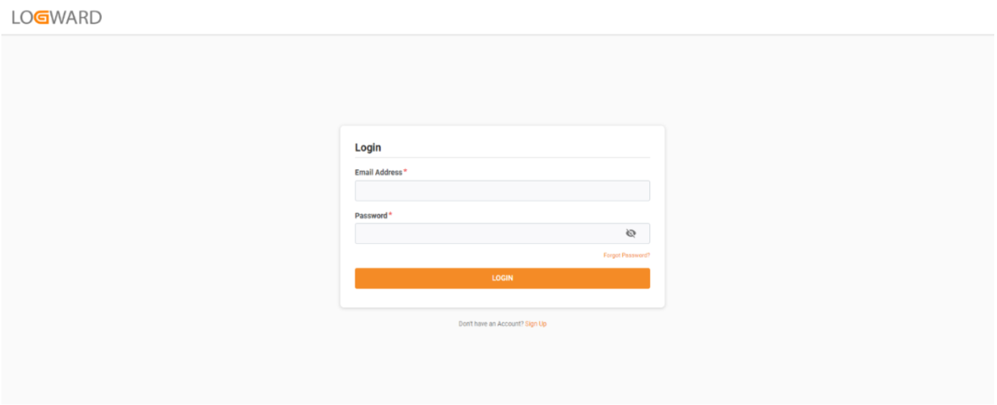
2.1. Login
Navigate to https://app.logward.com/ (Recommended browser is Google Chrome, although other browsers work too. Internet Explorer is not recommended).
Here you will find the login page, where credentials should be entered.
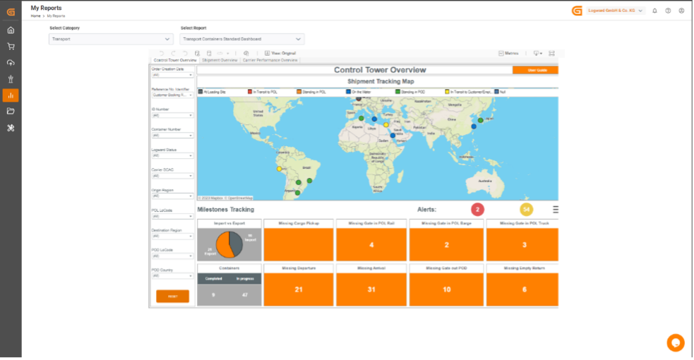
2.2. My reports
Click on “My reports” on the side-bar panel, then choose a category from the dropdown “Select Category” on the top and select a report from “Select Report”. The selected dashboard provides an overview of the current and historical performance and analysis through dynamic visualizations (see Figure 1 - Allocation Management Standard Dashboard).
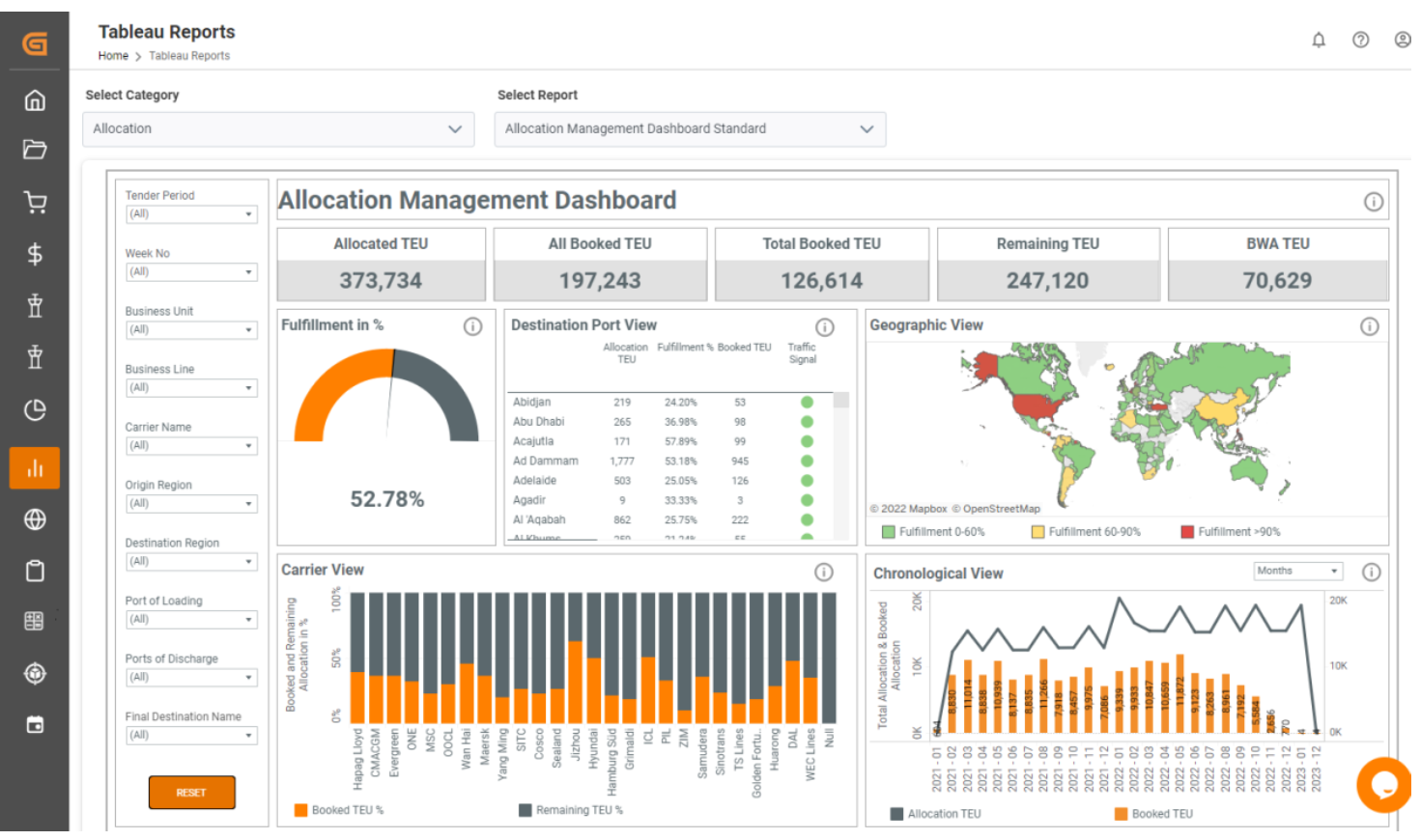
Figure 1 The Allocation Management dashboard in “My Reports”
3. Main functionalities
The dashboards are interactive and user-friendly. This section describes the key functionalities and their benefits.
3.1. Filter panel
You can add filters, which apply to the whole dashboard. These filters help to highlight specific data across different variables, such as time periods, business lines, regions, etc. (Figure 2). The filter is cleared by clicking the reset button, which will bring back the entire visualization to the default view. Dashboards have also different sections with titles and different visualizations known as widgets. In the selected widgets you can drill down and open a window with the information displayed in a table format for analysis and download as a Microsoft Excel file. To see how this feature works, please refer to Section 3.3. Underlying data.
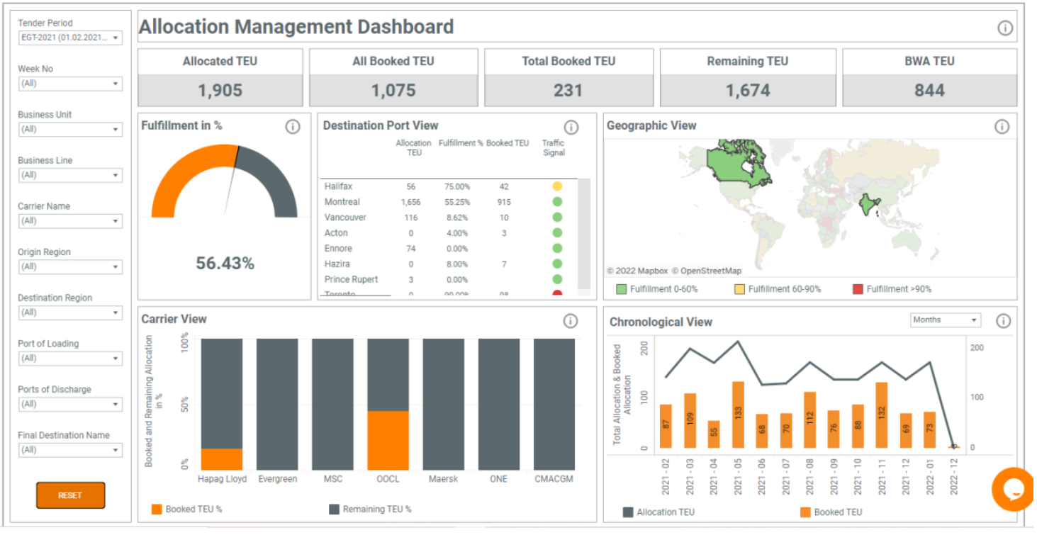
Figure 2 Filtered Geographic View
3.1.1. Dropdown filters
Click on the text field of the filter to see all options. Multi-value selection is possible, so you can select one or more checkboxes. Click “Apply” to filter the visualizations on the dashboard.
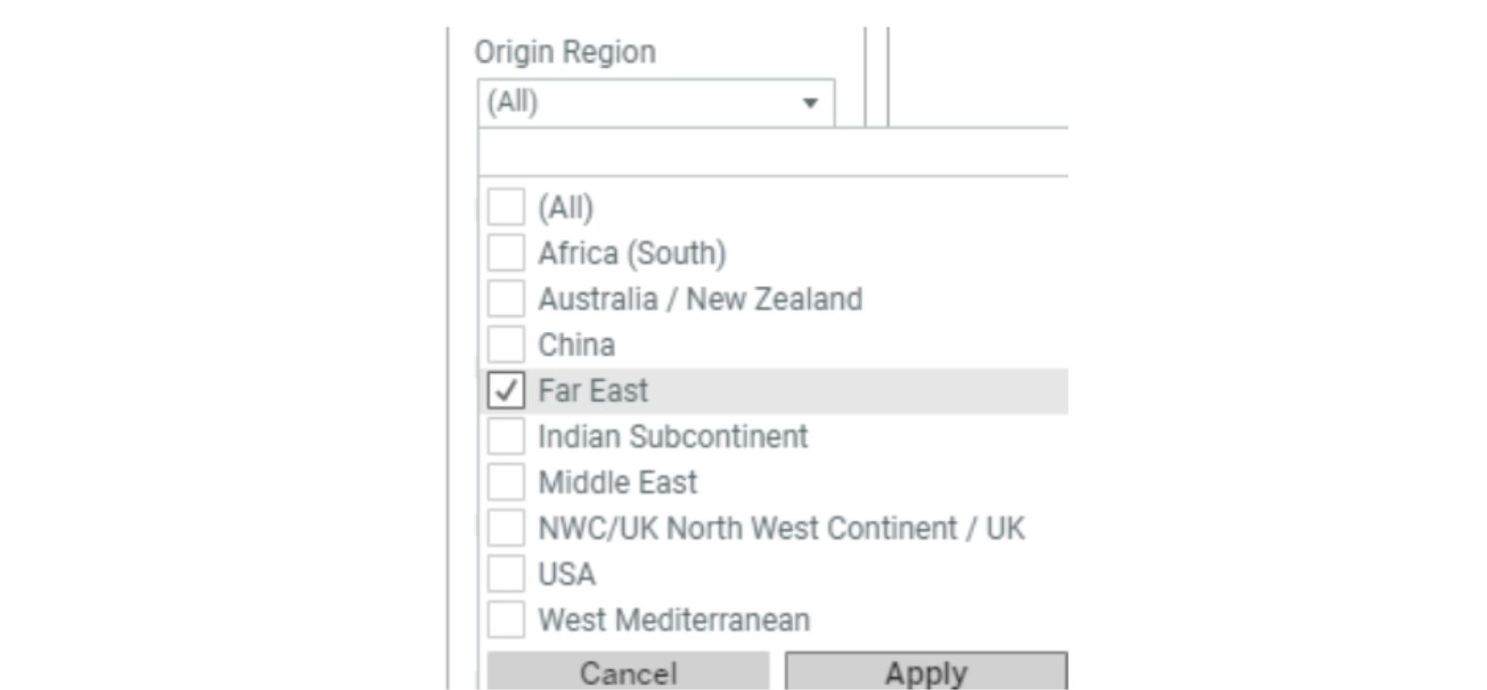
Figure 3 Dropdown Filter
3.1.2. Action filters
Since visualizations on the dashboards are interactive, when they are selected, they apply filtering to all other visualizations on the same dashboard.
An example is the Geographic View visualization. Clicking on one or more countries within the map, affects other charts within the dashboard for the selected values (see Figure 2 above). The same works for stacked bar charts. Clicking on a month or a carrier name filters the whole dashboard.
Note: For multi-selection on any visualizations hold the CTRL button and left click to select multiple values.
3.1.3. Reset filter
The filters can be cleared with the reset button, which brings back all visualizations to the default view.

3.2. Informational features
There are several features available on the dashboard to display tooltip text. There is tooltip text that explains each visualization in detail. Click on the information button to display or hide the information.

Hover on any bar, line, or country to see data point details. A tooltip displays the data used in the visualization (see Figure 4).
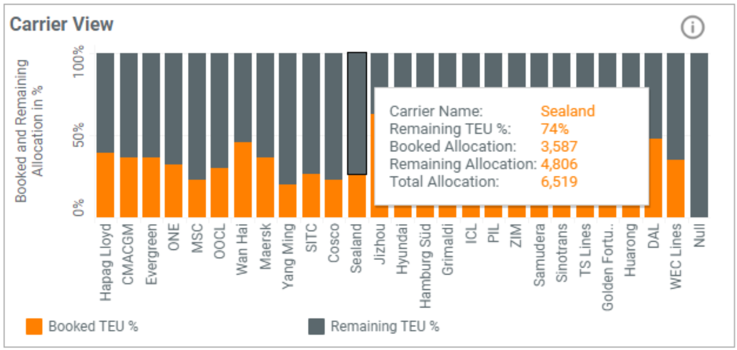
Figure 4 Tooltip
3.3. Underlying data
By clicking on any bar, carrier name, country, or line you can download the underlying data. After clicking on it a window opens - select “View Data” from the tooltip menu (it is marked in red in Figure 5).
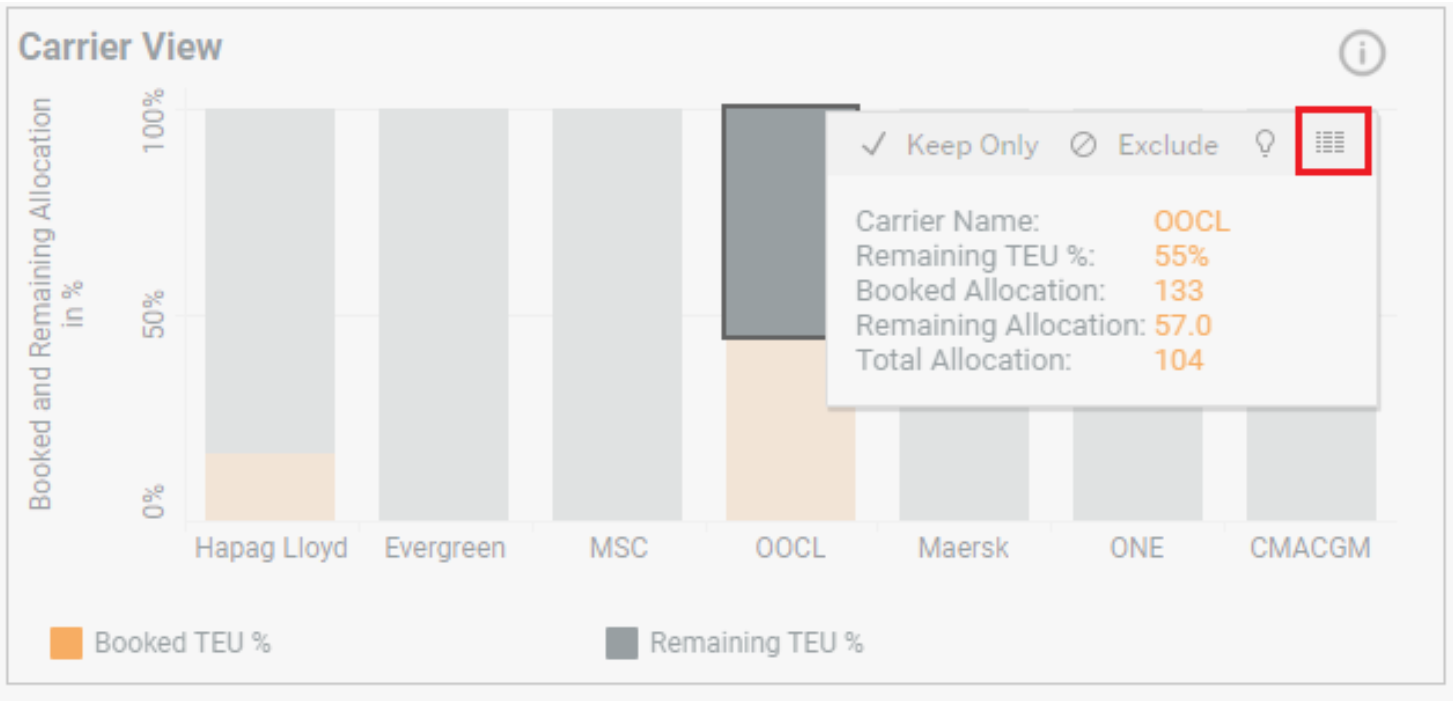
Figure 5 View Data
After clicking on “View Data” a new window opens. It shows key information for the chart. To view the full underlying data click on “Full Data”. In View Data you are able to select only the columns that are relevant to you. To do this click on the “Show Fields” button and select which columns you wish to show or hide. After that, you can download it as a CSV file. To do so, use the 'Download' button as shown in Figure 6.
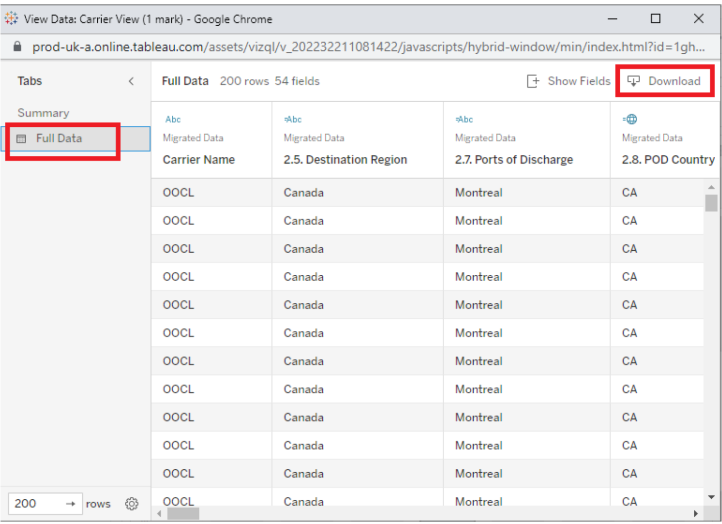
Figure 6 Download Underlying data
3. The Toolbar
The toolbar above the dashboard has additional functionalities that enhance your experience of the Dashboard. Here is the list of options that are now enabled for you to get more comfortable with "My Reports".

Figure 7 Toolbar
- The Undo, Redo and Reset buttons.
- The Refresh Data Source button.
- Custom Views.
- Download Content as Image/PDF/PowerPoint etc.
- Full Screen Mode of the Dashboard.
4.1 Undo, Redo and Reset
While performing actions on the dashboards, you will surely interact with the visualizations by filtering data, checking out tooltips or navigate to underlying data. The Undo, Redo and Reset Buttons help with easy transitioning and to retrace your steps back to where you started.
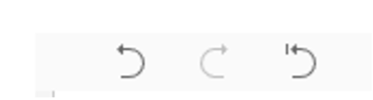
Figure 8 Undo, Redo and Reset Buttons
The Reset button on the toolbar resets action filters that work when you click on visualizations such as the tracking map, pie charts or bar charts, which then work as a filter on the dashboard. The Reset button on the toolbar takes the dashboard back to its default view.
4.2 Refresh Data Source
If there has been a recent update to the data source in the background and the dashboard has cached information from the previous update of the data source, the Refresh button would clear the cache and update the dashboard based on the change in the data.
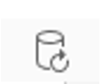
Figure 9 Refresh Data Source
4.3 Custom Views
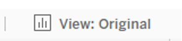
Figure 10 Custom Views
These custom views are a powerful feature that helps you save a significant amount of time in your daily use of the Dashboard Reports. If you have a specific set of filters and actions you need for the best utilization of the report to aid operations, you can now easily save these configurations as a predefined template by clicking on the “View” button on the toolbar.
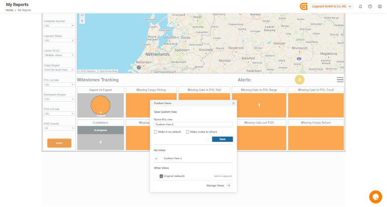
Figure 11 Saving custom views
The next time you return to the dashboard, you can click on Views and choose your template to directly jump to the filtered view of the dashboard.
4.4 Download Content
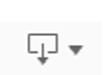
Figure 12 Download Button
The essence of the dashboard is your data. Without it, it would be a blank canvas. Your request to download the data and visualizations in any way possible, as Image, PDF, PowerPoint is now answered. This shall aid your daily operations in presentations or data sharing.
The download button has a dropdown that allows choosing different formats to download the content of the dashboard in.
You can also download the entire data set in CSV and Excel format. Next, you have the option to pick certain visualizations or the entire tab to download.
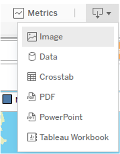
Figure 13 Options to download content in different formats
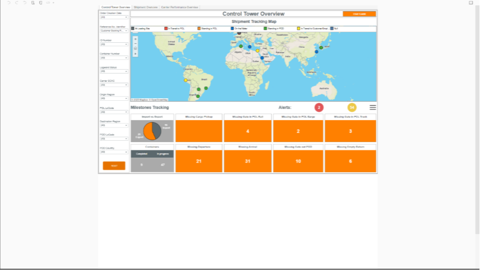
4.5 Full Screen Mode

Figure 14 Full Screen Button
Click on the Full Screen button at the end of the toolbar, which puts the dashboard in presentation mode. This gives a bigger and better view of the dashboard by putting the application window in the background.
BEFORE Figure 15 Normal View
AFTER Figure 16 Full Screen View
Take a look at one of Logward's standard dashboards here.
If you have any queries, reach out to [email protected]